Clinical Trials Patient Tracker
ui/UX DESIGN lead | research analysis | BRAND STRATEGY
Tools: Figma, Asana, Illustrator, Photoshop

Medrio is an international clinical trials software company that supports pharma, biotech, medical device, diagnostics, and animal health organizations. They are the market leader in early phase trials and serve over 600 customers globally, with headquarters in San Francisco and offices across the United States, Europe, and Asia.
Having worked with a multidisciplinary team at Medrio for over 3 years on graphic design and digital design projects, I approached them with a potential project for a major design overhaul of one of their current digital products, the ePRO (patient-reported data platform) app.


By reviewing Medrio’s extensive primary and secondary research, I was able to understand the benefits of electronic patient-reporting platforms, data collection needs, data-driven user needs and pain points, as well as evaluate the successes and shortcomings of Medrio’s current ePRO product.
Research Goals:
Determine Medrio’s business goals
Define the purpose of patient-reported outcomes
Learn about popular clinical trial apps on the market
Learn about other apps patients are using
Determine primary user demographic
Learn about the knowledge base patients have about their health
Define common behaviors of clinical trials patients
Determine users’ needs and frustrations when reporting data
Identify areas of the current platform that can be improved

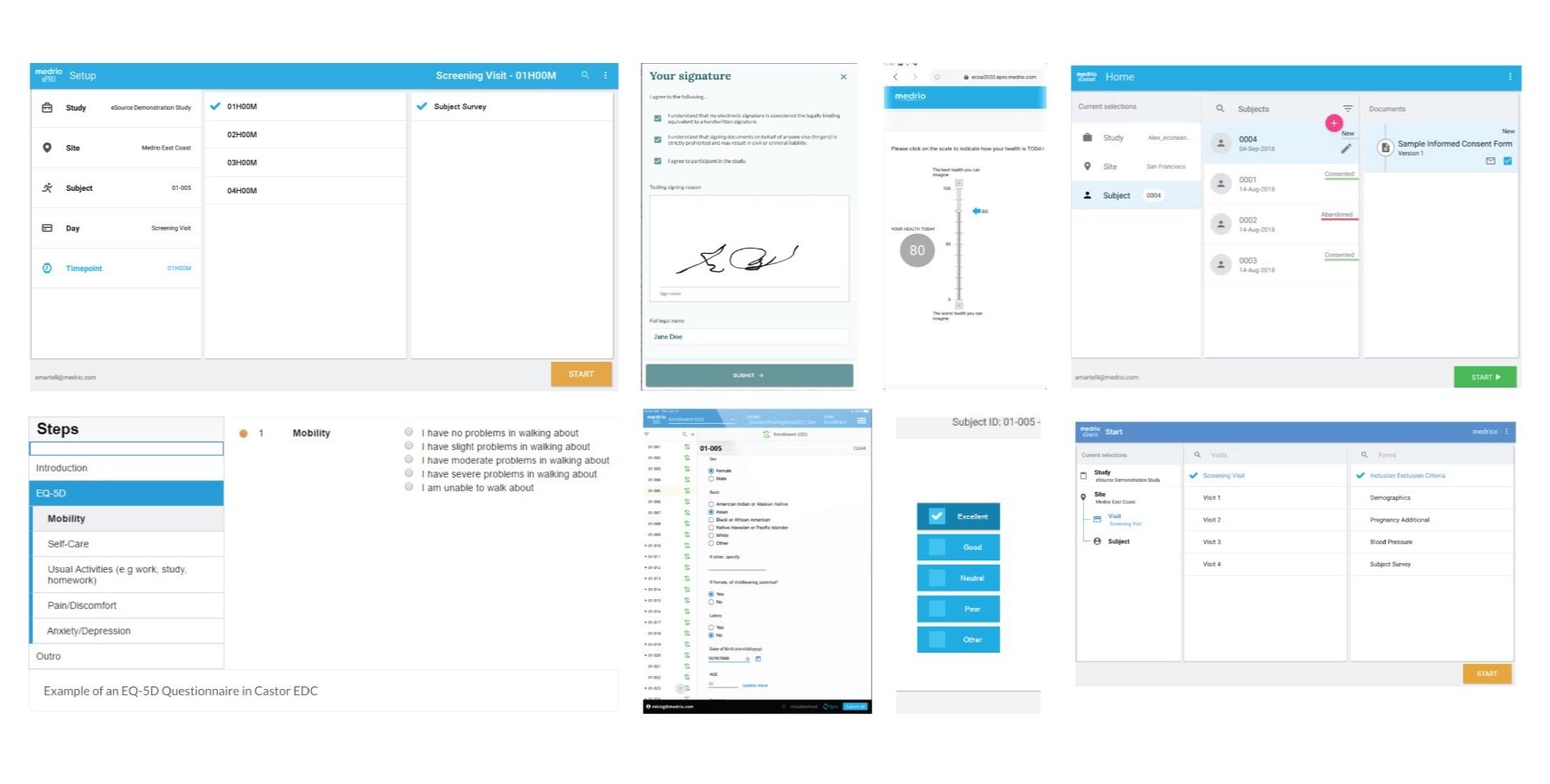
The current ePRO platform instantly appears outdated in functionality and aesthetic. The current product is focused on data collection and clinical results with the trial stakeholders in mind, not the patient. The current product fails to meet the user’s needs by lack of accessibility considerations, not engaging the under-represented and underserved populations, and failing to consider the patient’s mental and emotional well being.
For ePRO to benefit both the business and the user, a design overhaul with a focus on patient empathy and engagement must be done.
Key pain points from current users:
“Too clinical”
“Too much text”
“Difficult to read”
“Hard to navigate”
“I don’t understand it”
"Unclear expectations”
“Not sure if doctor sees it”
“Rating scales don’t make sense”

Based on quantitative and qualitative research findings, I created two personas that helped provide empathy for the users by considering their journey and defining their pain points. Analysis of the current ePRO product revealed a lack of consideration for patients with permanent, short term, and situational disabilities as well as the holistic well-being of the clinical trial participants. I created 2 users with disabilities from different backgrounds to better explore the needs of patients involved in clinical trials


By creating a User Journey Map I was able to put myself in the patient’s shoes to discover the specific steps they take in the clinical trial journey and identity their challenges, pain points, and goals throughout the trial.

By using the Crazy 8’s and the HMW or “How Might We” exercise, I was able to rapidly sketch out ideas for various touch points along the user’s journey. I explored data visualization, data entry methods, rewarding feedback, and notifications to help empathize with the user and create a more patient-centric experience.


After empathizing with the user in their journey, I created a user flow diagram to show how users interact with the product and help define the user’s journey as well as the screens they may encounter.


By testing clickable prototypes on users of varying abilities, I was able to suss out beginning to end experiences, find potential problems and discover user pain points. Key take aways from the Usability Testing phase were: the product needs larger character images / illustrations to make it feel more personal, the users wanted larger and more “pop up” notifications, and more customization in naming the trial / medications.
The testing phase allowed me to create a more enjoyable and informed experience for the clinical trial patients.


The first interaction the users have with the ePRO app is the registration phase. I created a registration experience that allows the user to feel like a friend, not just another patient.

After creating an account, the user meets Mia and embarks on a quick tutorial of what to expect from the trial and how to use their new ePRO account. One of the key takeaways from the User Research was that the brand voice was too clinical. Mia gives the app personality and keeps the users informed along the way.

During the usability testing phase, I discovered that users wanted more pop-up notifications that require immediate attention. Some notifications provide the user with the option to be reminded later while some notifications immediately alert doctors.

Through User Research and the Usability Testing phase, I discovered that the most frequently viewed screens are the Home, Medications, Log, Appointments, and Insights screens. Each screen has a dashboard with the most important information that populates according the date and frequency of use so the users can easily see patterns and quickly input the most frequently logged data.

Providing multiple visual cues for the user to easily be able to see where they are in their journey affords them assurance, comfort and safety. One of the chief pain points found with the current ePRO app is the lack of reassurance that information was correctly input. The primary complaint area was medications and dosage. When a dose has been completed, a checkmark is darkened and when the daily dosage has been completed, the entire container darkens, allowing the user to quickly observe their medication status. If a dose is forgotten, Mia provides a pop up with a reminder.
